
BRANDING
FINEX INSURANCE
Building a modern and dynamic brand identity for a next-generation insurance solution.
[ SOFTWARE ]
Adobe Illustrator
Adobe Photoshop
[ GOAL ]
Modern insurance branding
The Challenge
Breaking the mold of the traditional insurance industry
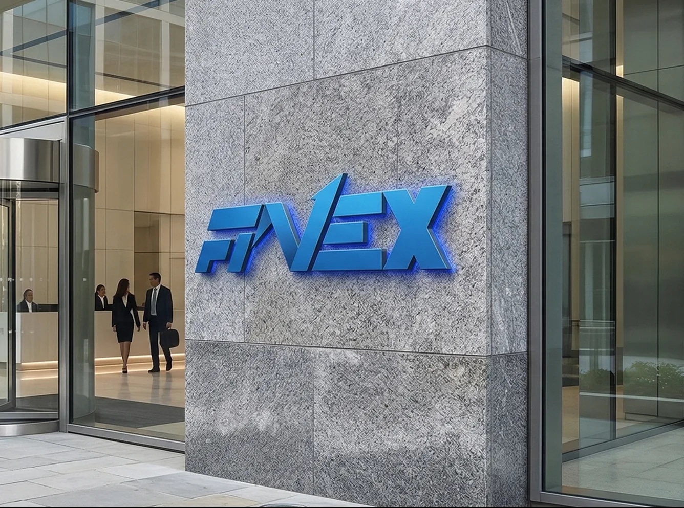
FINEX required an identity that conveyed stability and protection while also radiating a pioneering spirit. The challenge was to visualize continuous progress and leadership without losing the trust expected in financial and insurance services.
Our Solution
A direction-driven identity system
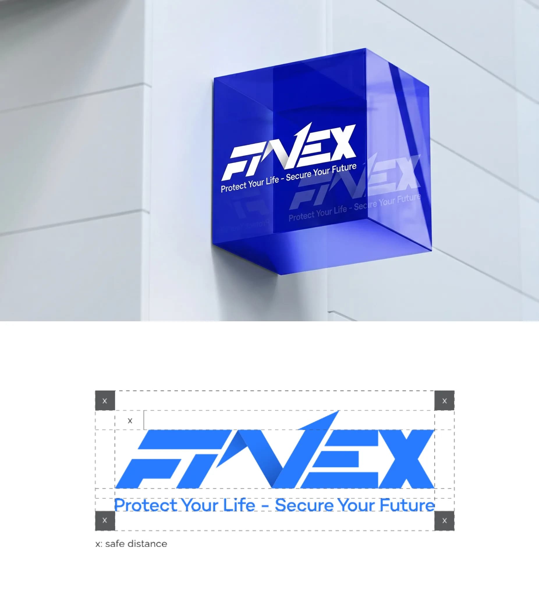
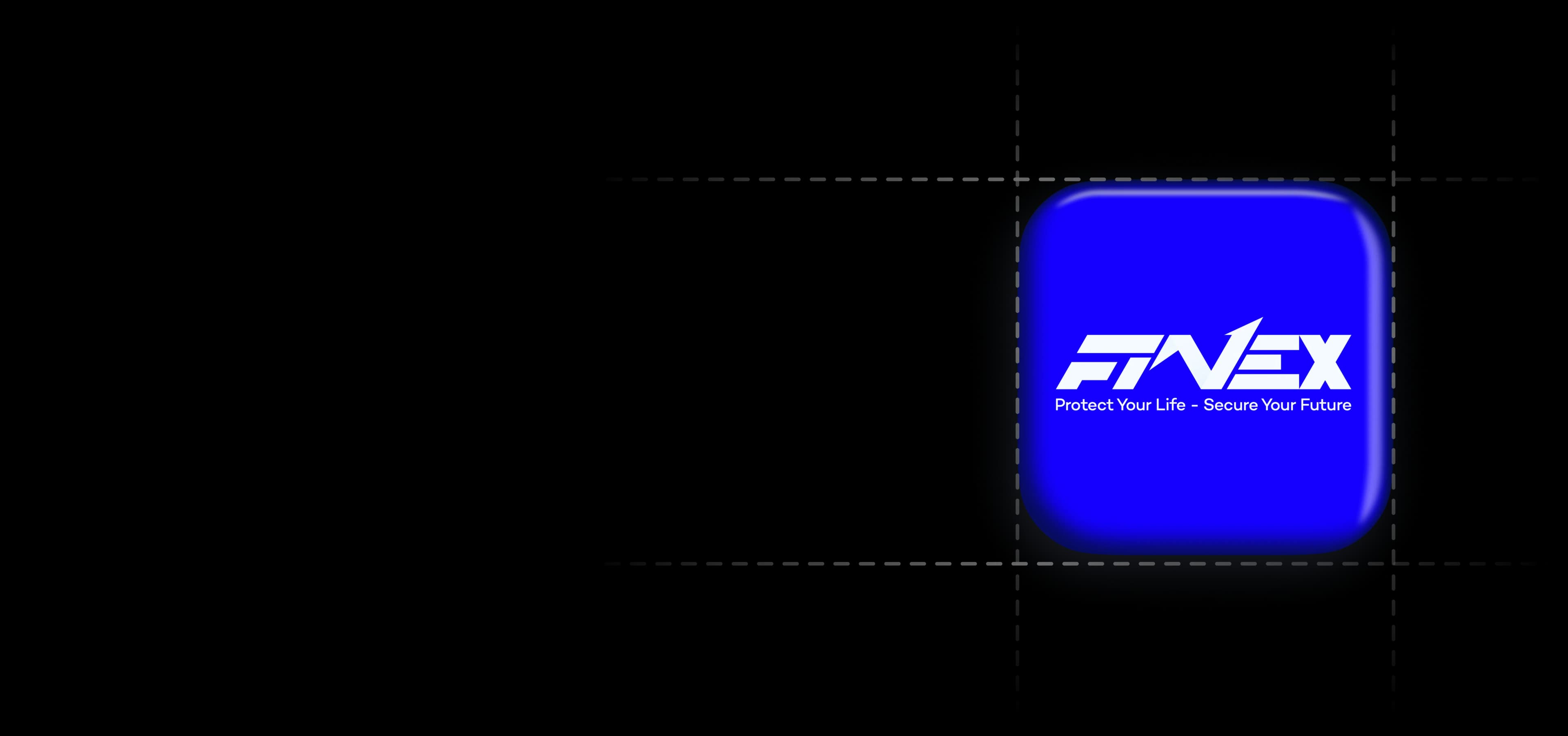
We designed a highly geometric logo using sharp 60-degree angles to create movement. The letter N is stylized as an upward-pointing arrow, balanced with a primary blue palette and light brown accent for innovation, stability, and prosperity.
Brand Anatomy
Precise logo proportions pair with a versatile typography system, using Campton for impactful headlines and Raleway for clean body text across print and digital applications.
Meaningful Pattern System
Three pattern variations from the letter F create a flower for prosperity, a pinwheel for constant innovation, and wings for protection and freedom.
Result
Affirming a next-generation leadership position
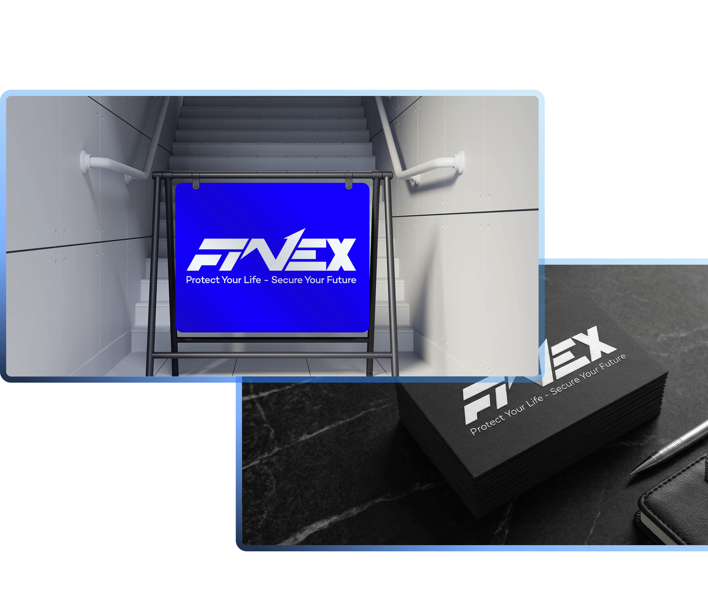
The standardized brand guidelines gave FINEX a clear design compass, helping the brand keep a professional image across communication campaigns and build stronger customer trust.
3
Meaningful pattern variations from the letter F
1
Complete brand guideline system, print to digital
Start now