
BRANDING
VANGUARD CONTINENTAL SERVICES
Building an inspiring and globally connected brand identity for the aviation and travel services industry.
[ SOFTWARE ]
Adobe Illustrator
Adobe Photoshop
[ GOAL ]
Global aviation service identity

The Challenge
Conveying dedication on a global scale
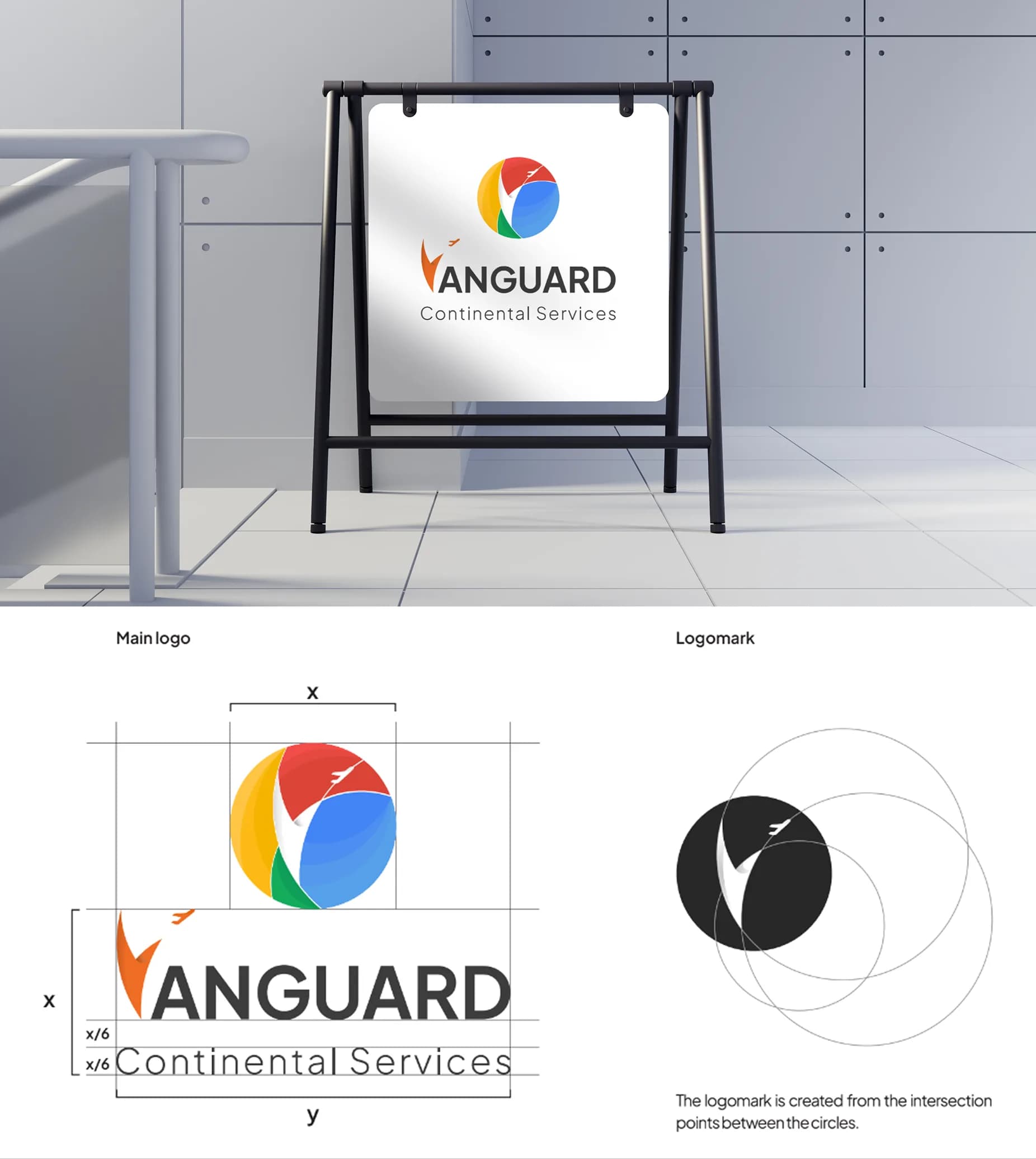
Vanguard Continental Services was created to accompany passengers through tiring flights and complex procedures. The challenge was building an identity system that reflects international vision and flexibility while radiating enthusiasm, dynamism, and friendliness.
Our Solution
A symbol of borderless connection
We designed an iconic logo where the letter V is formed by intersecting flight routes across continents, paired with an airplane taking off inside a sphere that represents globalization. Orange brings positive energy, while a diverse palette expresses integration and youthfulness.
Smart Pattern System
Two versatile patterns extend the identity: one inspired by the V symbol and airplane, and another using intersecting flight-line structures across uniforms, gifts, and office documents.

Modern Typography Architecture
Plus Jakarta Sans with flexible weights gives the brand clarity, modernity, and approachability across every communication touchpoint.


Result
Ready for the era of globalization
Standardizing the identity system gave Vanguard Continental Services a consistent, energetic image across all touchpoints, building stronger trust with international customers.
2
Versatile pattern systems for every touchpoint
1
Unified global identity, uniforms to documents





Start now